Great decisions rely on great information. Communicating key insights from data is critical to laying a successful strategy for your NFT investing journey. NFTGO crafts insightful stories of NFT data through powerful visualizations. We’re writing the next chapter of this story.
At NFTGO, we strive to make a compelling and meaningful experience of NFT data for the end user, This is ultimately about continued growth and improvement of our features.
The NFT market is fast-paced and ever changing. You can harness the power of NFTGO’s features to boost your strategies and keep up with the latest changes in the market.
New and exciting features from NFTGO help you uncover interesting correlations between NFT data and recognize complex patterns in a meaningful way.
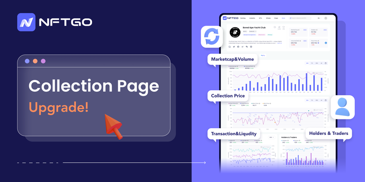
Telling a good story of data brings ideas into life and makes drawing actionable insights faster. NFTGO’s tools let you explore and collect important information in an interactive way. These new features include Optimizing and reconstructing NFT collection pages!
The story has never been told before
Before you had to toggle between Overview and Status to view more details from a collection, why not have it on one page instead?
There are a variety of ways to approach data, this way sets you up for success by presenting all the hidden gems in the data with full details in one page. This makes it easier to uncover stories that were hidden behind the walls of intricate data points.
Are there any interesting correlations between market cap and volume?
Recognizing correlations in data points is much easier with our new UI. Instead of two separate line charts-like before-, you can now view the data in a more organized and intuitive way in a combination of bar charts and line charts. This helps you distinguish between patterns and identify crucial correlations.

This chart is from The Sandbox project.

These two graphs are illustrating the same data. But which one tells a more vivid story?
The key is in merging important data and finding correlations from the overlap of them. In that way, we can see more clear patterns that don’t rely on speculation and volatility of the market.
The volume for projects can be volatile. Due to trading activities, it can spike quickly and fall instantly after that. Oftentimes looking at only one data point in data analysis can make us biased towards noises and get us away from the underlying truth.
On the other hand, market cap would give us a better understanding of the value of the large sales happening on the market by measuring the price in NFT sales -not necerality the amount-. In this way, we can gauge long-term and promising trends in profitable NFT projects.
Let’s get back to the data from The Sandbox, what is it telling us?

We can see that during the last 24 hours, the volume has had spikes with the largest happening at 4:30 AM. This means that there was a huge trading activity that bypassed the market cap. Even though the volume has had pumps and dumps, the prices remained more steady. The SandBox’s prices only started to show changes in longer-term trading activity trends.
What if the floor price isn’t useful on its own?
Fair enough, all marketplaces show you the floor price. How many times has the floor price in a collection caught your eye but as soon as you start to look for NFTs around that price, the excitement turns into a hopeless search because all the other NFTs are above the price. There is a lot of useful information that hides behind the walls if you don’t pay attention to every dimension of price changes. NFTGO goes beyond the typical floor price data and captures all the useful insights about the pumps and dumps in the market. The data isn’t presented in a snapshot of that moment but rather is a graph through time. This is the perfect tool for identifying trends in the market price.
By choosing a duration or setting up your own costume period from the calendar on the top right corner of every graph, you can get a view of the data from that period. We highlight specific data points such as the lowest (in yellow) and highest (in blue) price and also the trends in floor and average price.
We put the real-time floor price for the project alongside the trends in your chosen period. In this way, not only can you view the sales prices but also the differences between the real-time floor price and other sales.

Here we can see an illustration of price movements in the last 24 hours for The SandBox. The circles represent every sale that has happened during the period. We can have our floor price as a reference to view how much sales activity is present below or above the floor price. The second half of the graph is crowded with many sales below the current floor price. We can see its impact on the average price as well. The lowest sale happened earlier in this short cycle -highlighted with yellow-. Even though these sales were present, the project seems to be back at the about 3ETH floor price. The highest sale prices -highlighted in teal- both sold their metaverse properties at 8ETH.
How quickly can I sell my NFT?
The liquidity of an asset is a measurement of its demand in the market. Remember the supply and demand curve in Economics101? Well, now it’s showing up in all successful NFT projects. We harness the power of this simple yet powerful microeconomics concept and apply it in our investor toolkit. With the new update, you get to enjoy a comprehensive time series of sales and transfers and liquidity all in one place. Not only does this graph show a strong positive correlation between these three parameters but it also shows you how impactful each of the parameters are in the overall stats. We could’ve just added up the values and shown one chart, but in this way, the information is more distinguishable and organized. By employing intuitive colors in elegant graphs, you can directly consume the data in the most effective way.
All investors are looking for active and passionate markets. Within the NFT projects, there are some with a more active trader community and high demand. These projects are easy to identify using liquidity.
The market cap for projects with more liquidity experiences more sudden changes whereas for illiquid projects it roughly stays the same.
I’ll compare two different projects in their performance with respect to the liquidity and transactions associated with them.
The graphs are from The SandBox and My Pet Hooligan.
For The SandBox, we can see that a huge chunk of activity in the last 24H was in transferring NFTs.

This has not impacted the liquidity of the project. We can see the clear patterns in liquidity and sales activities by looking at the charts from My Pet Hooligan.

Takeaways
Data is a powerful engine for guiding our decision-making when it comes to investing. NFTGO is on a mission to bring you the best experience with NFT data. You can use the powerful visualization tools provided by NFTGO and be a part of the new chapter of our products. Data is more intuitive when seen visually and with our new update, we’ve taken a step further and developed comprehensive analysis tools in a user-friendly way.